The skinny
Font should be of a sans serif type with distinctive letterforms and defined characters to increase legibility for low vision readers. Font size should be easy to read at an arm's length on any device and colour contrast should be AAA.
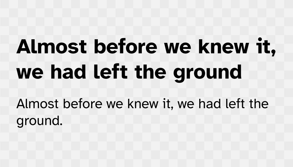
Figure 1: Sans-serif font with correct line spacing.
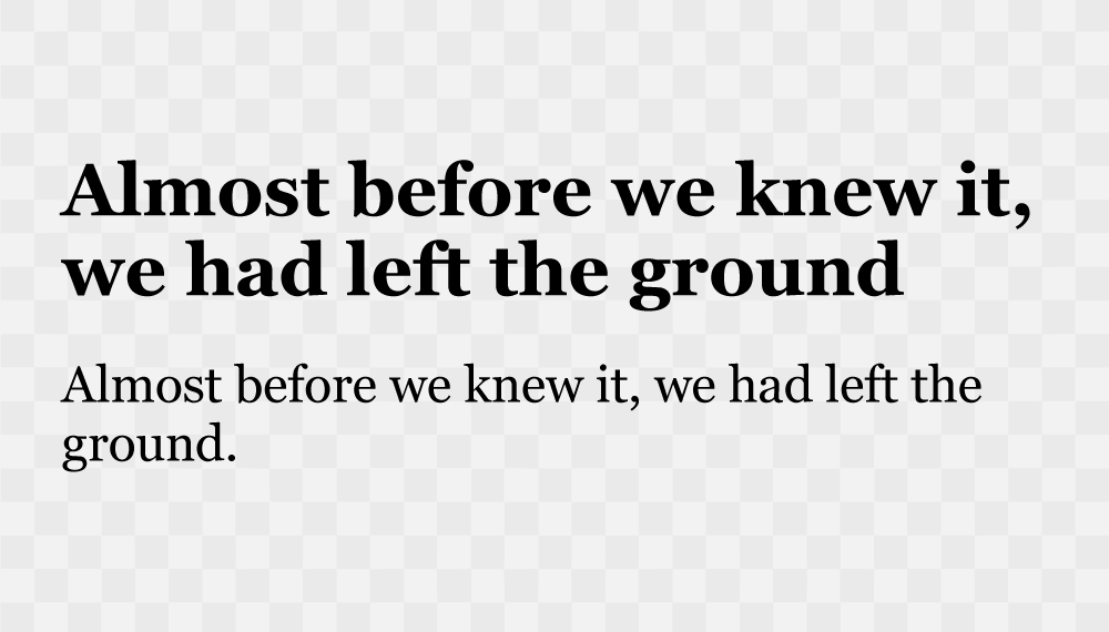
Figure 2: Serif font with incorrect line spacing.
The detail
Choosing the right font has many considerations such as brand recognition, visual aesthetic and legibility. For the wide audience base in an LMS, the incorrect font can greatly diminish the act of learning - or worse - turn off a learner entirely. Sans-serif fonts should be chosen for body copy; not all LMS users have access to or own a device with high-definition or retina screens frames rates above 120 Hz where a serif style font has improved screen legibility. LMS Analytics identify users using LCDs screens with 110 PPI as the norm, with 14-inch diagonal screen real estate and smaller handheld devices. The 1ease of reading for lower-end devices is greatly maximised by a sans-serif typeface. The right font choice supports learners with Dyslexia and Dyscalculia, providing improved eye-tracking and avoiding ambiguous character styles or letters appearing crowded. 2Font size should be 1rem - 1.25rem / 16px - 20px from a base value of 16px, smaller size fonts for labels and image captions should use increased letter–spacing, approximately 35% of the average letter width.
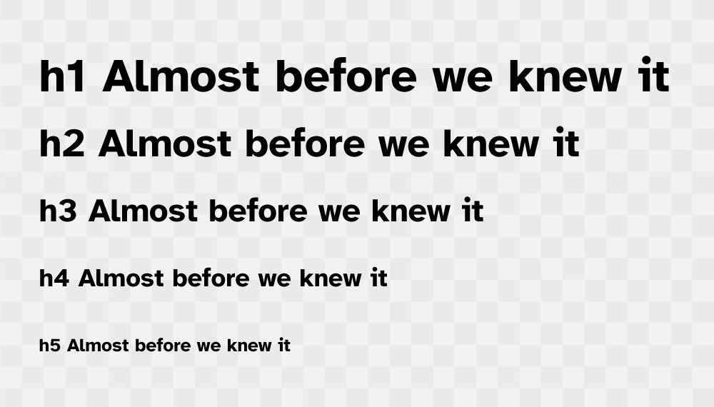
Figure 4: Atkinson Hyperlegible font shown as a heading structure.
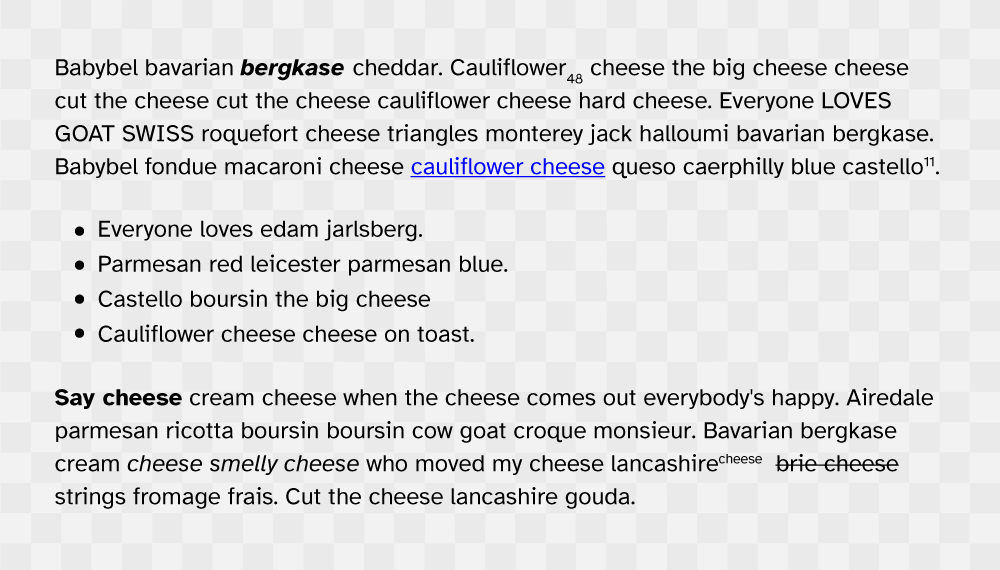
Figure 5: Atkinson Hyperlegible font paragraph and list styles.
Font hierarchy should be simple, heading font sizes should be at least 20% larger than body fonts and use heavier weight or bold style. Line spacing from 150% to 170% greatly improves legibility for Dyslexic neurotypes and uses with low vision. These considerations also support learners with low executive function providing little in the way of surprise or disrupting a reading flow. Where font presentation is utilitarian and the writing style is concise, the content can shine - learning takes place in the brain, not on the screen, and the use of simplistic character styles means visual processing can be improved. By removing complexity and increasing legibility, anxiety is reduced and the reader is less overwhelmed with the learning content. The key principle to selecting the right LMS font style is to reduce cognitive effort to read a word, allowing the learning material to increase cognitive effort so learning can take place. You can read more about choosing an accessible font here.
UX Laws considered
Neurotypes considered
Updated: 22 November 2023