The skinny
The layout positioning of important elements should be consistent to support expectations. Navigation menus, content areas and footers have established placements in an interface, changes to those common areas should be avoided. Providing an uncluttered, organised arrangement of elements reduces cognitive load and choice paralysis. Only elements fundamental to the page objective should be visible, the 'nice to have' should be omitted or concealed.
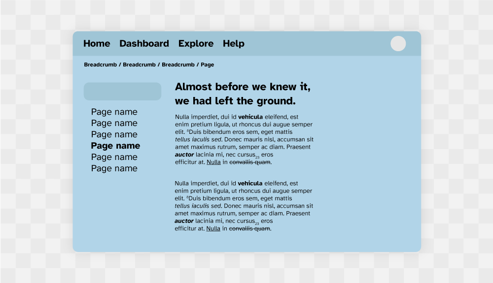
Figure 1: Minimalist interface.
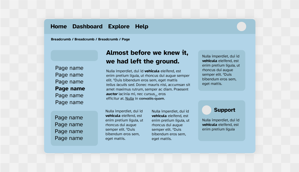
Figure 2: Cluttered interface.
The detail
The importance of offering choice to learners is fundamental when considering a broad user demographic. It's common design to clutter an interface with all the options a learner may need to navigate to and from a course, dashboard, enrolment, facilitator profile and assessment area on one page, the added options of resources (primary, secondary and extra reads) along with references and important policy links all end up making their way into the visual field of a learning experience. Panels are typically used to group and present 'important' content, that will, at some point be helpful during learning. It's also common with an LMS that multiple teams or departments are stakeholders in the learning experience and feel their component needs to be always present.
An LMS layout must consider a minimal layout to reduce the negative costs of opportunity exclusive to the paradox of choice, by considering the necessary (good) cognitive stress (eustress) in learning content as fundamental - navigation, fixed notices, branding, contact information and decretive elements must not compete for the learner's attention, but rather "dissolve" from view, become concealed or be omitted completely.
The dangers of being overwhelmed by choice are very real for everyone, however, 1learners with ADHD tend to choose less complicated/ stressful tasks (become distracted or procrastinate) when faced with multiple options. By considering the content architecture of an LMS page with the perspective of "learning content first", design decisions can be made for navigation and tools. Learning content architecture should also be considered, course titles, course codes, taglines, and irrelevant images/ graphics/ clipart must also adhere to rigorous decision making - if it does not inform the learning, it's more likely to distract from it.
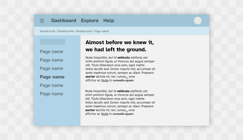
Figure 3: Zoning areas of importance with colour on desktop.
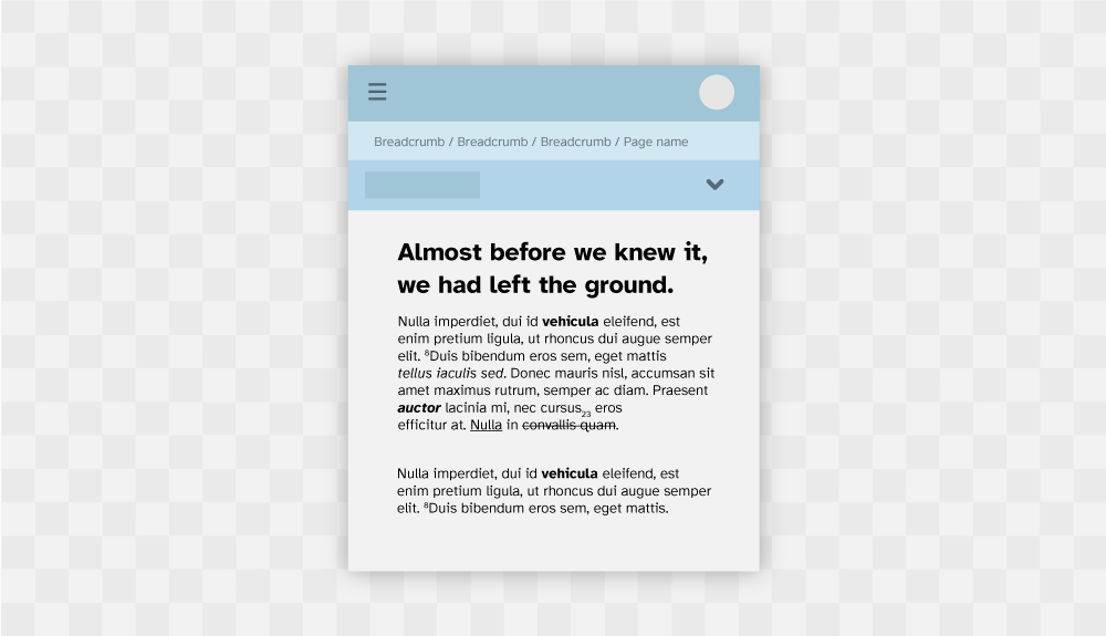
Figure 4: Zoning areas of importance with colour on tablet.
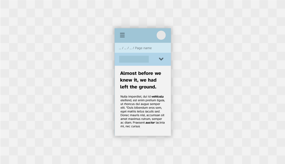
Figure 5: Zoning areas of importance with colour on mobile/ cell phone.
Colour selection can also greatly enhance an online learning environment, reducing or blocking large areas with one colour reduces the chances of information overload. It's equally important that the LMS UI appears aesthetically pleasing in design, although the system should be considered utilitarian in function, utilitarian by design does not mean bland or ugly. Learners are more tolerant of minor usability issues when a learning utility has aesthetic appeal, this also helps create a positive response to challenging learning content. 2By conserving complexity such as simplifying the LMS UI, learners begin attempting more complex tasks, and 3eustress can take place in the planned learning content.
UX Laws considered
Further reading
Updated: 22 November 2023