The skinny
Indicators, validations, notifications, emails, and messages all play a critical role in system adoption. Managing coherent instruction through complicated procedures should be brief, clear, and succinct to ensure learner retention. The dangers of broken processes, contradicting naming conventions and inconsistent styling are high with a large LMS, such issues create confusion, and disengagement and the learner to feel they're failing education.
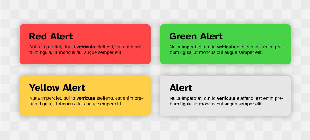
Figure 1: Alerts family consistent pattern in one system.
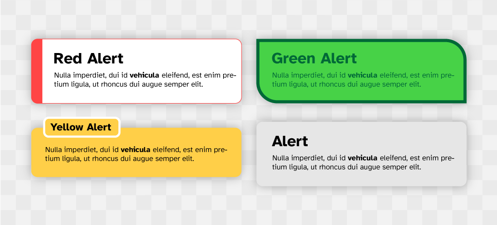
Figure 2: Inconsistent alert family design in one system.
The detail
Onboarding is not always the solution, an LMS already presents learning content that has a high cognitive cost, having learners begin using a complicated system before the real learning begins creates cognitive fatigue and puts learners on the back foot before embarking on their learning journey. Instead, an LMS should be intuitive enough, so a learner understands the page function before interacting with elements. The use of succinct titling and subtitling (short sentences of component use or instruction) that describe the page use and context are often enough. A user tour may be helpful if unique system components are present, but in general layout, components and structure should follow an established pattern.
High thinking cost procedures such as sign-up, payments and enrolment should follow a contained step-by-step process not left to the user to piece together from notifications, emails and support material located somewhere else. Fractured processes are often dismissed if not guided or obvious, and studies have shown many users will rather experiment by clicking and stumbling across a required action instead of being guided, given the option. Persistent naming conventions are vital for navigating an LMS, breaking convention creates mistrust of an object, link or location and can derail a learning flow state.
Visual style should also follow a convention that relates to an onboarding process or fractured communication, such as email and support material. It's often the visual style of a UI that is initially recognisable as one ecosystem, an LMS should use characteristics that are instantly recognisable as the system, and not rely on branding, such as a logo. Small details such as no button border-radius (if previously used) can create unnecessary ambiguity. All users including neurotypical learners benefit from concise, empathetic instruction that sounds human and addresses the person.
System alerts and validation messages also need to use a human tone, either 'up-beat' or 'joyful' if a message of success, 1should a message be of an error made by the user then it should be polite and direct to a solution instead of just stating the error. Appropriate cultural phrases can also improve the voice and tone. Notifications and indicators should also consider a cultural tone, doing so can create an informal connection with the user, passive notifications are great for this, such as 'great news, your enrolment has been accepted'! and indicators 'your assignment has been submitted, good luck'!. These uses of familiar voices to comms are not uncommon across the web a more human-centred approach to system notifications can be found in most places.
UX Laws considered
Neurotypes considered
Updated: 22 November 2023