The skinny
Choosing the right font for learners will increase retention time, reduce fatigue and support good stress. A legible, readable font should be a sans-serif, humanist typeface, with suitable letter and word spacing. Simple shapes assist with speed and help reduce cognitive loads.
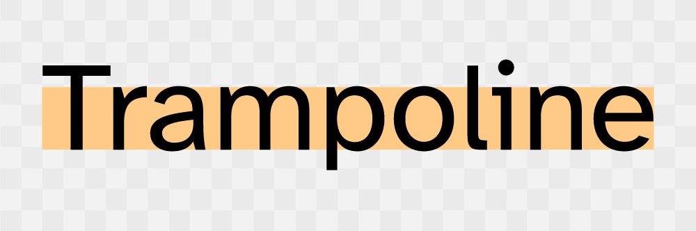
Figure 1: Atkinson Hyperlegible.
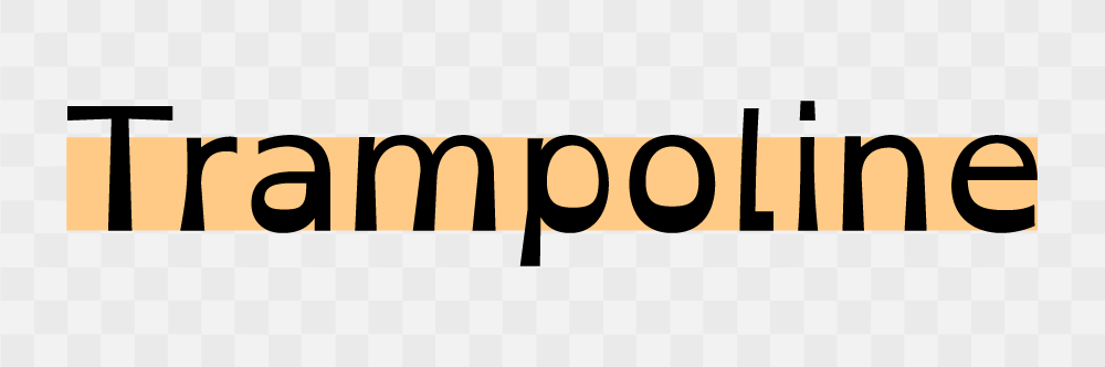
Figure 2: OpenDyslexic 2.
The detail
Users within an LMS are of wide-ranging types, from skilled bookworms to unconfident readers, all are experiencing the same environment of stress/ eustress (good stress) that online education brings. Fostering that good stress by providing a typeface that aids fair legibility and readability is a baseline to successfully building a positive learning environment. Considering learners of all abilities a less formal typeface is likely to be the best choice. Serif fonts tend to present an emotional response of authority, higher learning and maturity, whereas sans-serif fonts do not tend to harbour a defined emotional response, but functionally tend to be more legible and readable than their more ornate counterpart.
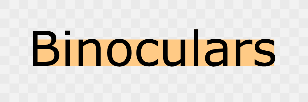
Figure 3: Verdana Regular a sans-serif font.
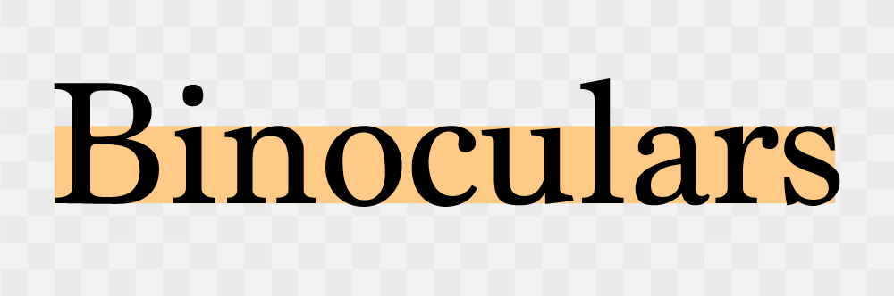
Figure 4: Marion Regular, serif font.
An LMS font should minimise the occurrence of imposter letter shapes, such as upper case 'I', and lower case 'l' and the number '1' can appear to look the same. The font also needs to reduce (preferably be omitted from the selection line-up if) letters begin mirroring each other, such as 'b' and 'd', 'p' and 'q'. Some learners with executive functioning issues can struggle with flipped letters, selecting a font with unique shapes for each character will greatly aid success.

Figure 5: Characters 'I', 'l' and '1' in Gill Sans.
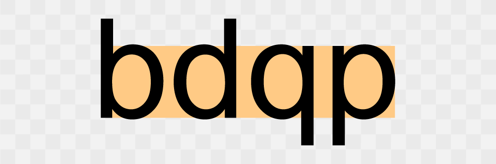
Figure 6: Characters 'b', 'd', 'q' and 'p' in Arial Regular.

Figure 7: Characters 'I', 'l' and '1' in Tahoma Regular.
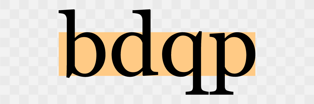
Figure 8: Characters 'b', 'd', 'q' and 'p' in Georgia Regular.
Low Vision and more severe vision impairment learners can struggle with typefaces that are too closed and apertures too tight, grotesque typeface styles are also hard to read at smaller sizes. Humanist typefaces are more open and tend to have unique character widths, these fonts are more legible at varying sizes and provide accurate letter recognition at speed. Neurotypical learners also benefit from varied character widths as well as a font with a visible difference between character descenders and capital height. These considerations greatly reduce ambiguity and vastly improve character decoding and word recognition, resulting in a less stuttered reading flow and reduced reading anxiety. Crowded words and letters cause Learners with dyslexia to experience reading difficulties such as the 1river effect and swirl effect, where words become combined and distorted due to alignment issues and overcrowding. By opening up the letter spacing, increasing the gap between each word and improving line height, these experiences can be greatly reduced, and reading is improved for everyone.
Figure 9: Grotesque font style.
Figure 10: Humanist font style.
The debate continues for single-storey and double-storey characters, the main offenders are lowercase 'a' and 'g'. Humanist style fonts often choose to use the common hand-drawn, single-storey style of lowercase 'a' and 'g', in the understanding that double-storey character shapes are hard to draw as a child, and single-storey shapes are common handwritten forms, therefore visually decoding those character forms when reading is likely to be easier with single-story. 2However, some studies show no disenable difference for dyslexia or neurodiverse readers in legibility or readability of fonts using single or double-storey characters. 3There is ongoing research, developing and testing from GEL (The Global Experience Language, BBC's shared design framework) regarding their Reith typeface, which suggests double-story characters perform better when read on a screen. The takeaway is both character types are not an issue for readers as once thought. Lastly, it’s important to consider the beautification of a font, the emotional connection and functionality should coexist with supported science and testing. 4Many font styles claim to be accessible for learners with Dyslexia, Dyscalculia and even Irlen Syndrome but lack the data to support such claims.
It’s important to understand that character decoding happens by cognitive processing, font shapes that slow the speed of reading use the thought of slowing the reading pace to give the brain more time to process what it sees, however, what an accessible typeface should do is aid the speed of reading to match the brains processing speed and thus an unrestricted flow state can be fostered.
UX Laws considered
Neurotypes considered
Further reading
- Big Hack: Font Accessibility and Readability
- Time: Almost Nobody Can Write This Letter of the Alphabet Correctly
- Science Direct: A Ventral Visual Stream Reading Center Independent of Visual Experience
- National Library of Medicine: Inter-letter Spacing, Inter-word Spacing, and Font With Dyslexia-friendly Features
Updated: 22 November 2023