The skinny
Colours are subjective and their meanings often change with a cultural shift. Colour is an influential tool to inform and direct but should be used to enhance a design and not dictate, primary colour selection for any LMS should be contrasted, providing options for neurotypes and changing cognitive states of all learners.
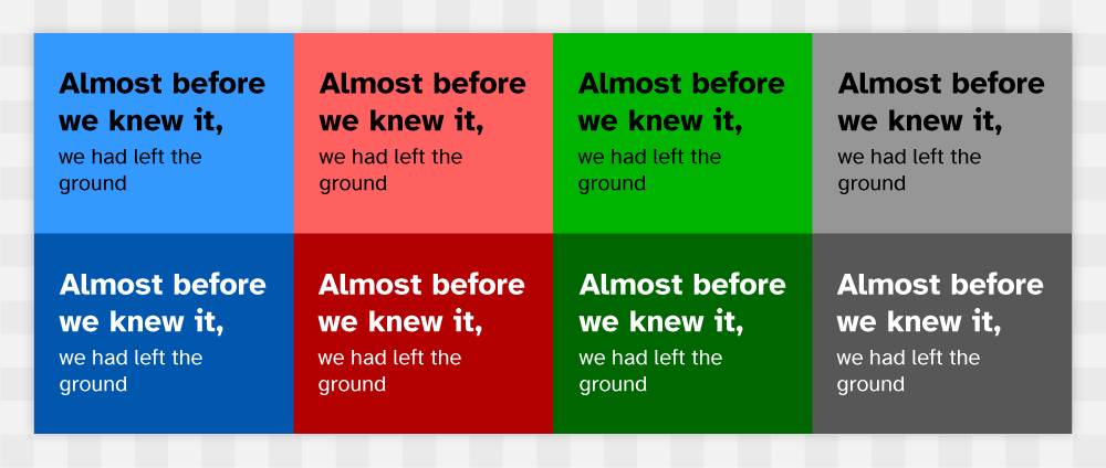
Figure 1: Foreground and background colour combos with AAA compliance.
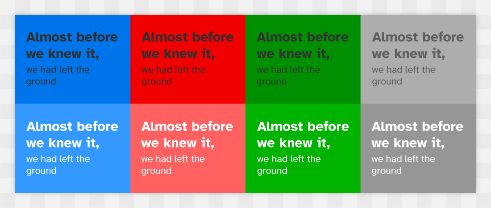
Figure 2: Foreground and background colours with non-compliant combos.
The detail
Colour choice is a fundamental tool for enhancing a visual aesthetic, informing a user of a system state change and button type hierarchy (submit, cancel, upload, delete...). An LMS should consider the use of contrast as the fundamental driver to colour choice. Learners with low contrast sensitivity (often senior learners), learners who cannot distinguish between certain colours ('colour blindness'), and Dyslexia and Dyscalculia neurotypes often benefit from higher contrast designs. However, colour choice does not only consider non-neurotypical learners but can also greatly support learners in states of cognitive fatigue (mental exhaustion, focus, over and under-stimulation). The use successful of contrast also improves reading in situations where users who may be learning 'on-site' or outside in the daylight, high contrast improves reading with unwanted glare in the sunlight.
Figure 3: A very common system colour for the submit button, green in this instance can represent 'action' or 'go'.
Figure 4: Typical system colour for cancel buttons, blue can represent 'neutral' or 'not urgent'.
Figure 5: Red is often used a delete button, this colour can represent 'perminant' or 'critical'.
The choice of colour for text and icons on solid-coloured backgrounds should meet accessibility standards; a minimum contrast ratio of 4.5 (AA) is acceptable, but a contrast ratio of 7+ (AAA) is preferred for main/ body text. Photography and graphics that make up decoration do not require such stringent consideration. Photography and graphics that are part of learning content and inform the learner of location and action should also adhere to WCAG Colour Contrast Accessibility Standards. Consistency across all elements, using colour to distinguish their importance, should be used. To ensure the connectedness of elements that call for an action, the same colour should be used - for example, the upload, post, and enter buttons all present an intention to the action of exchange or confirmation. Using alternative colours for such a button, will cause disruption to working memory and the perceived intention of the button, causing hesitation (anxiety) and in some cases avoidance or worse bounce out. 1A uniform connectedness of all elements creates a sense of security, an organised pattern is innate to the human mind, and the use of colour is one key element in supporting this theory.
Figure 6 - 12. Coloured overlay options including system theme defualt options Light and Dark modes.
Although colour contrast is fundamental to initial design principles, cognitive fatigue can also be increased by high contrast (black text on white background). Learners with an oversensitive visual cortex, visual-perceptual disorder, and learners with dyslexia related difficulties (Irlen Syndrome) will experience processing issues identified as part of their neurotype. Visual stress can be greatly reduced with the addition of coloured UI mode, in addition to light and dark mode, common in most modern interfaces. Providing the option to switch the visual appearance of the interface to a 2specific hue and saturation from a wide selection of colours ensures that everybody's needs are met. The benefits of a colour mode option are not exclusive to learners with dyslexia, dyspraxia, ADD/HD or Autism. Neurotypical learners can also gain an advantage by reducing eyestrain when experiencing cognitive fatigue (if studying late at night or early mornings). Providing the option to appropriately change the visual appearance (text and background colours) will improve learning retention and ease anxiety related fatigue.
UX Laws considered
Neurotypes considered
Updated: 8 22 November 2023